3.6 KiB
3.6 KiB
Illustrations
The illustrations should always align with topics and goals in specific context.
Principles
Be simple.
- For clarity, we use simple and specific elements to create our illustrations.
Be optimistic.
- We are an open-minded, optimistic, and friendly team. We should reflect those values in our illustrations to connect with our brand experience.
Be gentle.
- Our illustrations assist users in understanding context and guide users in the right direction. Illustrations are supportive, so they should be obvious but not aggressive.
Style
Shapes
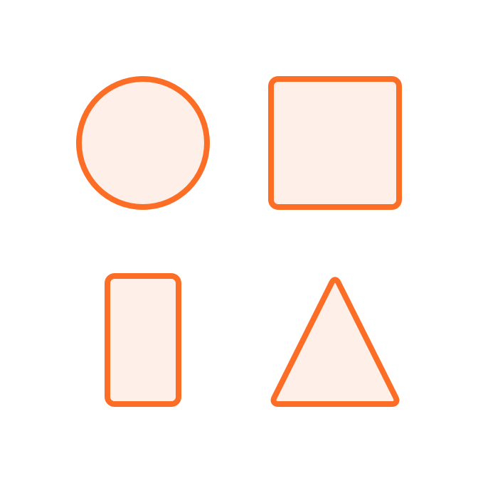
- All illustrations are geometric rather than organic.
- The illustrations are made by circles, rectangles, squares, and triangles.
Stroke
- Standard border thickness: 4px
- Depending on the situation, border thickness can be changed to 3px. For example, when the illustration size is small, an illustration with 4px border thickness would look tight. In this case, the border thickness can be changed to 3px.
- We use rounded caps and rounded corner.
| Do | Don't |
|---|---|
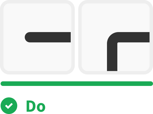 |
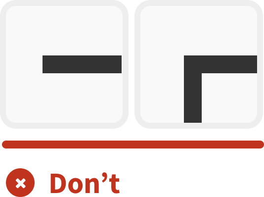 |
Radius
- Standard corner radius: 10px
- Depending on the situation, corner radius can be changed to 5px. For example, when the illustration size is small, an illustration with 10px corner radius would be over-rounded. In this case, the corner radius can be changed to 5px.
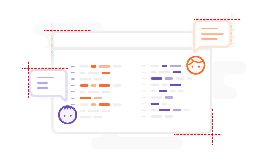
Size
Depends on the situation, the illustration size can be the 3 types below:
Large
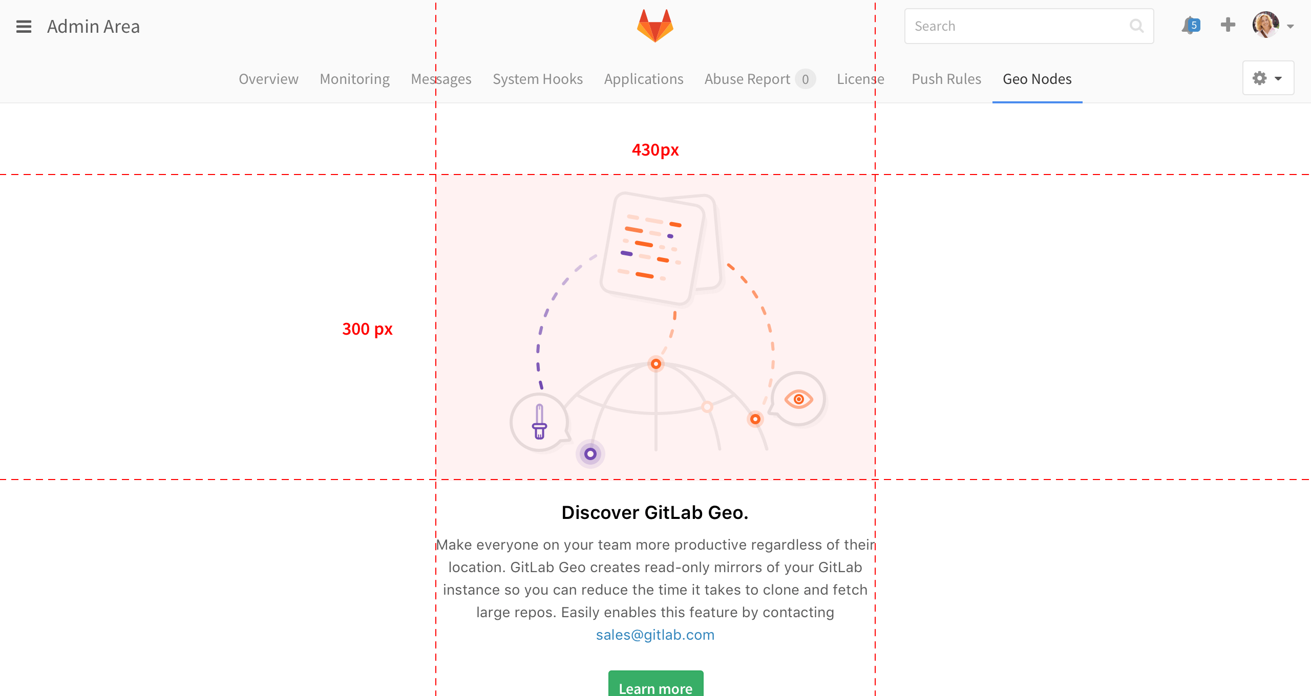
- Use case: Empty states, error pages(e.g. 404, 403)
- For vertical layout, the illustration should not larger than 430*300 px.
- For horizontal layout, the illustration should not larger than 430*380 px.
| Vertical layout | Horizontal layout |
|---|---|
 |
 |
Medium
- Use case: Banner
- The illustration should not larger than 240*160 px
- The illustration should keep simple and clear. We recommend not including too many elements in the medium size illustration.

Small
- Use case: Graphics for explanatory text, graphics for status.
- The illustration should not larger than 160*90 px.
- The illustration should keep simple and clear. We recommend not including too many elements in the small size illustration.

Illustration on mobile
- Keep the proportions in original ratio.
Colors palette
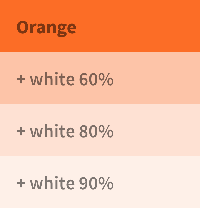
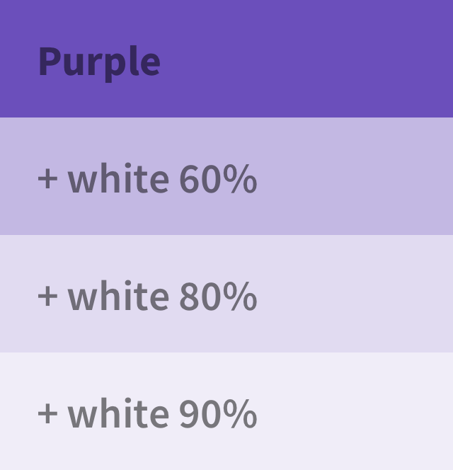
For consistency, we recommend choosing colors from our color palette.
| Orange | Purple | Grey |
|---|---|---|
 |
 |
 |
| #FC6D26 | #6B4FBB | #EEEEEE |
Don't
- Don't include the typography in the illustration.
- Don't include tanuki in the illustration. If necessary, we recommend having tanuki monochromatic.
| Orange | Purple |
|---|---|
 |
 |