7.4 KiB
Theming Documentation
Basic Architecture
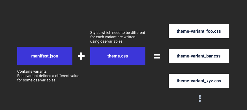
A theme collection in Hydrogen is represented by a manifest.json file and a theme.css file.
The manifest specifies variants (eg: dark,light ...) each of which is a theme and maps to a single css file in the build output.
Each such theme is produced by changing the values of variables in the base theme.css file with those specified in the variant section of the manifest:
More in depth explanations can be found in later sections.
Structure of manifest.json
Variables
CSS variables specific to a particular variant are specified in the variants section of the manifest:
 "variants": {
     "light": {
         ...
         "variables": {
             "background-color-primary": "#fff",
             "text-color": "#2E2F32",
         }
     },
      "dark": {
         ...
        "variables": {
            "background-color-primary": "#21262b",
            "text-color": "#fff",
        }
    }
 }
These variables will appear in the css file (theme.css):
body {
    background-color: var(--background-color-primary);
    color: var(--text-color);
}
During the build process, this would result in the creation of two css files (one for each variant) where the variables are substitued with the corresponding values specified in the manifest:
element-light.css:
body {
    background-color: #fff;
    color: #2E2F32;
}
element-dark.css:
body {
    background-color: #21262b;
    color: #fff;
}
Derived Variables
In addition to simple substitution of variables in the stylesheet, it is also possible to instruct the build system to first produce a new value from the base variable value before the substitution.
Such derived variables have the form base_css_variable--operation-arg and can be read as:
apply operation to base_css_variable with argument arg.
Continuing with the previous example, it possible to specify:
.left-panel {
    /* background color should be 20% more darker
       than background-color-primary */
    background-color: var(--background-color-primary--darker-20);
}
Currently supported operations are:
| Operation | Argument | Operates On |
|---|---|---|
| darker | percentage | color |
| lighter | percentage | color |
Aliases
It is possible give aliases to variables in the theme.css file:
:root {
    font-size: 10px;
    /* Theme aliases */
    --icon-color: var(--background-color-secondary--darker-40);
}
It is possible to further derive from these aliased variables:
div {
    background: var(--icon-color--darker-20);
    --my-alias: var(--icon-color--darker-20);
    /* Derive from aliased  variable */
    color: var(--my-alias--lighter-15);
}
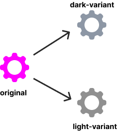
Colorizing svgs
Along with a change in color-scheme, it may be necessary to change the colors in the svg icons and images.
This can be done by supplying the preferred colors with query parameters:
my-awesome-logo.svg?primary=base-variable-1&secondary=base-variable-2
This instructs the build system to colorize the svg with the given primary and secondary colors.
base-variable-1 and base-variable-2 are the css-variables specified in the variables section of the manifest.
For colorizing svgs, the source svg must use #ff00ff as the primary color and #00ffff as the secondary color:
 |
 |
|---|---|
| original source image | transformation process |
Creating your own theme variant in Hydrogen
If you're looking to change the color-scheme of the existing Element theme, you only need to add your own variant to the existing manifest.json.
The steps are fairly simple:
- Copy over an existing variant to the variants section of the manifest.
- Change
dark,defaultandnamefields. - Give new values to each variable in the
variablessection. - Build hydrogen.
Creating your own theme collection in Hydrogen
If a theme variant does not solve your needs, you can create a new theme collection with a different base theme.css file.
- Create a directory for your new theme-collection under
src/platform/web/ui/css/themes/. - Create
manifest.jsonandtheme.cssfiles within the newly created directory. - Populate
manifest.jsonwith the base css variables you wish to use. - Write styles in your
theme.cssfile using the base variables, derived variables and colorized svg icons. - Tell the build system where to find this theme-collection by providing the location of this directory to the
themeBuilderplugin invite.config.js:
...
themeBuilder({
    themeConfig: {
        themes: {
            element: "./src/platform/web/ui/css/themes/element",
            awesome: "path/to/theme-directory"
        },
        default: "element",
    },
    compiledVariables,
}),
...
- Build Hydrogen.
Changing the default theme
To change the default theme used in Hydrogen, modify the defaultTheme field in config.json file (which can be found in the build output):
"defaultTheme": {
    "light": theme-id,
    "dark": theme-id
}
Here theme-id is of the form theme-variant where theme is the key used when specifying the manifest location of the theme collection in vite.config.js and variant is the key used in variants section of the manifest.
Some examples of theme-ids are element-dark and element-light.
To find the theme-id of some theme, you can look at the built-asset section of the manifest in the build output.
This default theme will render as "Default" option in the theme-chooser dropdown. If the device preference is for dark theme, the dark default is selected and vice versa.
You'll need to reload twice so that Hydrogen picks up the config changes!
Derived Theme(Collection)
This allows users to theme Hydrogen without the need for rebuilding. Derived theme collections can be thought of as extensions (derivations) of some existing build time theme.
Creating a derived theme:
Here's how you create a new derived theme:
- You create a new theme manifest file (eg: theme-awesome.json) and mention which build time theme you're basing your new theme on using the
extendsfield. The base css file of the mentioned theme is used for your new theme. - You configure the theme manifest as usual by populating the
variantsfield with your desired colors. - You add your new theme manifest to the list of themes in
config.json.
Refresh Hydrogen twice (once to refresh cache, and once to load) and the new theme should show up in the theme chooser.
How does it work?
For every theme collection in hydrogen, the build process emits a runtime css file which like the built theme css file contains variables in the css code. But unlike the theme css file, the runtime css file lacks the definition for these variables:
CSS for the built theme:
:root {
    --background-color-primary: #f2f20f;
}

body {
    background-color: var(--background-color-primary);
}
and the corresponding runtime theme:
/* Notice the lack of definiton for --background-color-primary here! */
body {
    background-color: var(--background-color-primary);
}
When hydrogen loads a derived theme, it takes the runtime css file of the extended theme and dynamically adds the variable definition based on the values specified in the manifest. Icons are also colored dynamically and injected as variables using Data URIs.