forgejo-federation/templates/user/dashboard
Francesco Siddi c14d3e80e8
Remove label color from global issue filters (#22660)
The use of ui colors (red, green, etc) should be limited to actionable
or dismissable entries. Before this commit, a green/red label was used
to display issues count on each repository. This did not add any
meaningful information to the list.

Removing the label reduces ambiguity and makes the list easier to scan
visually.
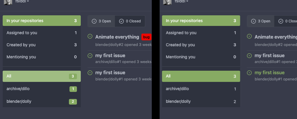

![label_compare](https://user-images.githubusercontent.com/451841/215360696-a881b765-207d-4ffa-8bec-398f8e5dab1e.jpg)

---------

Co-authored-by: delvh <dev.lh@web.de>
2023-01-31 20:58:34 +08:00
..
dashboard.tmpl Add class to page content to unify top margin (#13766) 2020-11-30 23:00:14 -05:00
feeds.tmpl Add code highlighting in issue titles (#21432) 2022-10-16 02:24:41 +08:00
issues.tmpl Remove label color from global issue filters (#22660) 2023-01-31 20:58:34 +08:00
milestones.tmpl Optimize html templates (#22080) 2022-12-09 21:34:51 +08:00
navbar.tmpl Optimize html templates (#22080) 2022-12-09 21:34:51 +08:00
repolist.tmpl Fix margin and alignment in dashboard repolist (#22120) 2022-12-17 09:58:57 +08:00