forgejo-federation/templates/repo/pulls
sebastian-sauer b81c013057
Don't stack PR tab menu on small screens (#25789)
the stacking takes up screen space - display the tabs as the navigation
bar. github uses the same layout.

Screenshots (left before, right after):
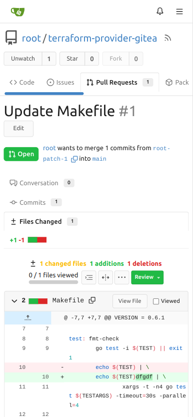

![image](https://github.com/go-gitea/gitea/assets/1135157/d7e2aaec-c67b-403d-8d56-d4c824b04eed)
![image](https://github.com/go-gitea/gitea/assets/1135157/9e150881-c265-4074-afd7-407bb52e1934)

Large screen:


![image](https://github.com/go-gitea/gitea/assets/1135157/d5cbdaa3-2962-4c4f-9595-5938981ff99e)
2023-07-14 01:54:20 +00:00
..
commits.tmpl Make Issue/PR/projects more compact, misc CSS tweaks (#24459) 2023-05-03 17:58:59 -04:00
files.tmpl Make diff view full width again (#24598) 2023-05-09 05:21:03 +00:00
fork.tmpl read-only checkboxes don't appear and don't entirely act the way one might expect (#25573) 2023-06-30 00:16:53 +02:00
status.tmpl Use data-tooltip-content for tippy tooltip (#23649) 2023-03-24 18:35:38 +08:00
tab_menu.tmpl Don't stack PR tab menu on small screens (#25789) 2023-07-14 01:54:20 +00:00