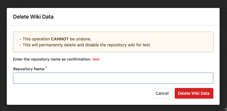
Follow #24393 The funny history: * At the beginning, `.ui.message` was polluted by `text-align: center` * Then people do `<div class="ui ... message text left">` * But `.ui.left` is polluted by `float: left` * Then people do `#xxx .ui.message { width: 100% !important;}` The code just becomes more and more hacky. After removing the pollution, everything becomes clear and straight. And, this PR also does: 1. Remove the `package.css`, its styles could be provided by `top aligned` 2. Remove `#avatar-arrow`, dead code Screenshot:   Co-authored-by: Giteabot <teabot@gitea.io> |
||
|---|---|---|
| .. | ||
| add_reaction.tmpl | ||
| attachments.tmpl | ||
| comments.tmpl | ||
| comments_delete_time.tmpl | ||
| context_menu.tmpl | ||
| pull.tmpl | ||
| pull_merge_instruction.tmpl | ||
| reactions.tmpl | ||
| reference_issue_dialog.tmpl | ||
| sidebar.tmpl | ||
| update_branch_by_merge.tmpl | ||