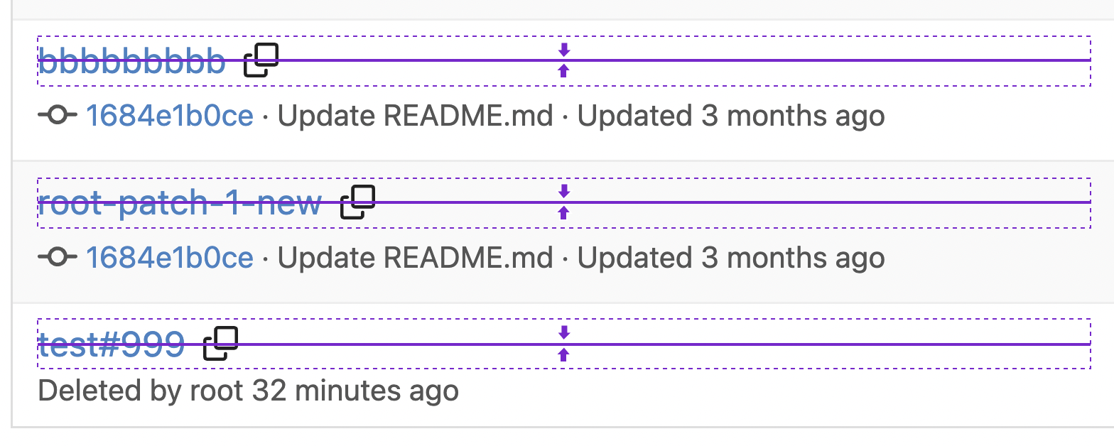
1. Put the `"octicon-shield-lock"` into the flex container, then it doesn't need a separate flex box 2. Remove some unnecessary `gt-df` helpers 3. Make `btn` button has the same flex behavior as `ui button`  
13 lines
473 B
Handlebars
13 lines
473 B
Handlebars
<!-- make sure this matches the color logic in web_src/js/components/DashboardRepoList.vue -->
|
|
{{if eq .State "pending"}}
|
|
{{svg "octicon-dot-fill" 18 "commit-status icon text yellow"}}
|
|
{{end}}
|
|
{{if eq .State "success"}}
|
|
{{svg "octicon-check" 18 "commit-status icon text green"}}
|
|
{{end}}
|
|
{{if eq .State "error"}}
|
|
{{svg "gitea-exclamation" 18 "commit-status icon text red"}}
|
|
{{end}}
|
|
{{if eq .State "failure"}}
|
|
{{svg "octicon-x" 18 "commit-status icon text red"}}
|
|
{{end}}
|