This PR is a possible solution for issue #22866. Main change is to add a
`author-wrapper` class around author name, like the wrapper added to
message. The `max-width` is set to 200px on PC, and 100px on mobile
device for now.
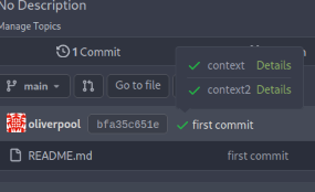
Since #22632, when a commit status has multiple checks, no check is
shown at all (hence no way to see the other checks).
This PR fixes this by always adding a tag with the
`.commit-statuses-trigger` to the DOM (the `.vm` is for vertical
alignment).

---------
Co-authored-by: Lunny Xiao <xiaolunwen@gmail.com>
Close #22847

This PR:

* introduce Gitea's own `showElem` and related functions
* remove jQuery show/hide
* remove .hide class
* remove inline style=display:none

From now on:

do not use:
* "[hidden]" attribute: it's too weak, can not be applied to an element
with "display: flex"
* ".hidden" class: it has been polluted by Fomantic UI in many cases
* inline style="display: none": it's difficult to tweak
* jQuery's show/hide/toggle: it can not show/hide elements with
"display: xxx !important"

only use:
* this ".gt-hidden" class
* showElem/hideElem/toggleElem functions in "utils/dom.js"

cc: @silverwind , this is the all-in-one PR
Add a new "exclusive" option per label. This makes it so that when the
label is named `scope/name`, no other label with the same `scope/`
prefix can be set on an issue.

The scope is determined by the last occurence of `/`, so for example
`scope/alpha/name` and `scope/beta/name` are considered to be in
different scopes and can coexist.

Exclusive scopes are not enforced by any database rules, however they
are enforced when editing labels at the models level, automatically
removing any existing labels in the same scope when either attaching a
new label or replacing all labels.

In menus use a circle instead of checkbox to indicate they function as
radio buttons per scope. Issue filtering by label ensures that only a
single scoped label is selected at a time. Clicking with alt key can be
used to remove a scoped label, both when editing individual issues and
batch editing.

Label rendering refactor for consistency and code simplification:

* Labels now consistently have the same shape, emojis and tooltips
everywhere. This includes the label list and label assignment menus.
* In label list, show description below label same as label menus.
* Don't use exactly black/white text colors to look a bit nicer.
* Simplify text color computation. There is no point computing luminance
in linear color space, as this is a perceptual problem and sRGB is
closer to perceptually linear.
* Increase height of label assignment menus to show more labels. Showing
only 3-4 labels at a time leads to a lot of scrolling.
* Render all labels with a new RenderLabel template helper function.

Label creation and editing in multiline modal menu:

* Change label creation to open a modal menu like label editing.
* Change menu layout to place name, description and colors on separate
lines.
* Don't color cancel button red in label editing modal menu.
* Align text to the left in model menu for better readability and
consistent with settings layout elsewhere.

Custom exclusive scoped label rendering:

* Display scoped label prefix and suffix with slightly darker and
lighter background color respectively, and a slanted edge between them
similar to the `/` symbol.
* In menus exclusive labels are grouped with a divider line.

---------

Co-authored-by: Yarden Shoham <hrsi88@gmail.com>
Co-authored-by: Lauris BH <lauris@nix.lv>
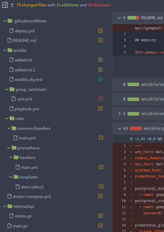
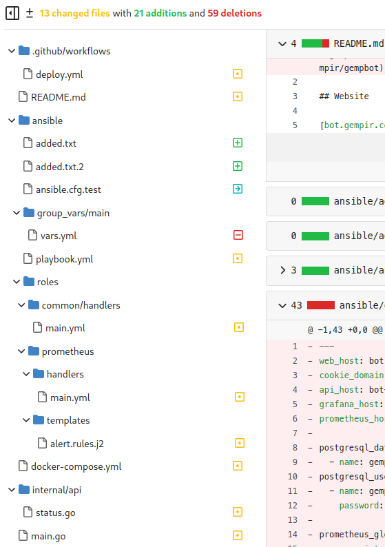
Collapsing folders currently just throws a console error
```
index.js?v=1.19.0~dev-403-gb6b8feb3d:10 TypeError: this.$set is not a function
at Proxy.handleClick (index.js?v=1.19.0~dev-403-gb6b8feb3d:58:7159)
at index.js?v=1.19.0~dev-403-gb6b8feb3d:58:6466
at index.js?v=1.19.0~dev-403-gb6b8feb3d:10:93922
at ce (index.js?v=1.19.0~dev-403-gb6b8feb3d:10:1472)
at Q (index.js?v=1.19.0~dev-403-gb6b8feb3d:10:1567)
at HTMLDivElement.$e (index.js?v=1.19.0~dev-403-gb6b8feb3d:10:79198)
```
This PR fixes this and allows folders to be collapsed again.
Also:
- better cursor interaction with folders
- added some color to the diff detail stats
- remove green link color from all the file names
Screenshots:


---------
Co-authored-by: zeripath <art27@cantab.net>
Co-authored-by: Lunny Xiao <xiaolunwen@gmail.com>
There was an unintended regression in #21124 which assumed that
`.commits-list .message-wrapper` would only match the commit summaries
on `/{owner}/{name}/commits/*`. This assumption is incorrect as the
directory/file view also uses a `.commits-list` wrapper.

Rather than completely restructure this page this PR simply adjusts the
styling to again use `display: inline-block;` for `#repo-files-table
.commit-list .message-wrapper`

Fix #22360

Signed-off-by: Andrew Thornton <art27@cantab.net>
There was a serious regression in #21012 which broke the Show More
button on the diff page, and the show more button was also broken on the
file tree too.

This PR fixes this by resetting the pageData.diffFiles as the vue
watched value and reattachs a function to the show more button outside
of the file tree view.

Fix #22380

Signed-off-by: Andrew Thornton <art27@cantab.net>
Co-authored-by: John Olheiser <john.olheiser@gmail.com>
Co-authored-by: Lunny Xiao <xiaolunwen@gmail.com>
- Fix regression from #21893 which had misaligned a few tables like repo
lists and e-mails
- Bring githooks list in line with webhooks list for styling
- Change webhook list icons to just colored dots, like githook list
- Increase size of dot in webhook and githook list from 16 to 22px
This should eliminate all non-variable color usage in the styles, making
gitea fully themeable via CSS variables. Also, it adds a linter to
enforce variables for colors.
- Fix placement of avatar image, this was not placed in the
`comment-header-left` and add CSS to cover the limiting of width+height
of avatar for code-review comment on "Files changed" page. This fixes
the big noticeable avatar issue.
- Apply `margin-bottom` to the "next" button, so it's consistent with
the "previous" button.
- Make sure the "next"/"previous" start at `flex-start` on mobile and
not off-screen at `flex-end`. As well force them to have `flex: 1` so
they won't overflow on x-asis. This also requires the `width: 100%` for
the `.ui.buttons` div.
- Resolves #20074


### Before
<details><img width="512"
src="https://user-images.githubusercontent.com/25481501/195952930-09560cad-419f-43a3-a8a4-a4166c117994.jpg"></details>

### After
<details><img width="512"
src="https://user-images.githubusercontent.com/25481501/197340081-0365dfa8-4344-46b4-8702-a40c778c073f.jpg"></details>

Co-authored-by: Lunny Xiao <xiaolunwen@gmail.com>
Co-authored-by: silverwind <me@silverwind.io>
This PR adds a filetree to the left side of the files/diff view.

Initially the filetree will not be shown and may be shown via a new
"Show file tree" button.

Showing and hiding is using the same icon as github. Folders are
collapsible. On small devices (max-width 991 PX) the file tree will be
hidden.

Close #18192

Co-authored-by: wxiaoguang <wxiaoguang@gmail.com>
- Remove arc-green specific rules and instead fix the colors in the base
rules.
- Make file table row border visible on arc-green.
- Remove remnants of fomantic accordeon module that was removed.
Remove this small, but unnecessary
[module](https://fomantic-ui.com/elements/image.html) and use `img`
selector over previous `.image`. Did a few tests, could not notice any
visual regression.

Co-authored-by: 6543 <6543@obermui.de>
Co-authored-by: Lauris BH <lauris@nix.lv>
- Since
b9e8fa5beb
the avatar will be inlined into the comment header, so there's more room
for the actual comment container(thus more text per line in the comment
body). However this didn't take into consideration that the flex didn't
allow any wrapping and thus was shrinking the avatar. Well this isn't a
perfect solution, as you ideally all want these elements to be
individually wrapped(such that `comment-header-right` can be on the same
line as `comment-header-left`, which now causes a new line in certain
situations). It's a better solution than the current CSS and to not
mess with the desktop CSS/HTML.

Co-authored-by: Lauris BH <lauris@nix.lv>
Co-authored-by: zeripath <art27@cantab.net>
This PR rewrites the invisible unicode detection algorithm to more
closely match that of the Monaco editor on the system. It provides a
technique for detecting ambiguous characters and relaxes the detection
of combining marks.

Control characters are in addition detected as invisible in this
implementation whereas they are not on monaco but this is related to
font issues.

Close #19913

Signed-off-by: Andrew Thornton <art27@cantab.net>
* Rework repo buttons

- Replace "New PR" and "Go to File" button with Icon Button
- Move all "Add File" actions into a dropdown button
- Remove most custom styling of clone buttons
- Margin and wiki tweaks

Buttons are now all equal height, mobile layout wraps gracefully.

Fixes: https://github.com/go-gitea/gitea/issues/13671
Replaces: https://github.com/go-gitea/gitea/pull/20375

Co-authored-by: Lauris BH <lauris@nix.lv>
Co-authored-by: zeripath <art27@cantab.net>
Co-authored-by: Lunny Xiao <xiaolunwen@gmail.com>
Use body text color in for links in the repository files table
Issue/PR links (`.ref-issue`) will not be affected, as seen in other git services.

Co-authored-by: silverwind <me@silverwind.io>
Co-authored-by: wxiaoguang <wxiaoguang@gmail.com>
Co-authored-by: Lauris BH <lauris@nix.lv>
- Update all JS dependencies minus vue ones
- Remove workaround for case-insensitive attribute selector
- Add new linter rules and fix issues
- Tested SVG display and swagger
- Firefox on Windows will unconditionally show scrollbars when you
specify `overflow: scroll`. This is bad behavior, as you don't always
need the scrollbar. Changing the scroll value to auto fixes this issue
and only shows the scrollbar when necessary.
- Resolves #20139

Co-authored-by: Lunny Xiao <xiaolunwen@gmail.com>
- File headers can become quite width, so ensure the file size is not
being wrapped into itself(width + padding-right) and allow the overflow
to be scrolled(overflow-x).
Automatically add sidebar in the wiki view containing a TOC for the wiki page.
Make the TOC collapsable

Signed-off-by: Andrew Thornton <art27@cantab.net>
* Make the wiki editor bar sticky for longer wiki edits

On codeberg community it was requested to make the wiki editor toolbar sticky for longer wiki posts, so one wouldn't have to scroll to the top to use it. (Reference; https://codeberg.org/Codeberg/Community/issues/533).

In order to make this happen, the .editor-toolbar class needs to become position: sticky, and we need to fix it's transparent background and border-bottom. Because the bottom disappears, we add it. This makes the border become a double border, because the CodeMirror area defines borders for all. As such I've added a border-top: none, on the wiki write tab for the CodeMirror class.

* Make the issue bar in the issue view sticky for issue #10675

In issue #10675 it's requested to make the issue bar sticky upon scrolling in the issue view. The proposed change changes inline html, which is not desirable. As such I've added the position sticky option to it's container, and fix the background upon scrolling.

* Make linter happy on _repository.less

Fix 0px -> 0 to make the linter happy.

* Make linter happy on _editor.less

Fix 0px -> 0 to make the linter happy.

* Change z-index to the lowest boundary of 1

As per review of @silverwind change the z-index to it's lowest requirement of 1.

* Change z-index to the lowest boundary of 1

As per review of @silverwind change the z-index to it's lowest requirement of 1.

* Revert changes made to wiki editor (unsticky) and add max-height

Fixes the max-height to 85vh, on the proposed 90vh it just came out just slightly too large.
Unstickies the changes from the sticky commits.

* Revert changes for the sticky title editor

Removes the changes as done by the sticky title editor.

* Add max-height definition to CodeMirror-scroll

Add the max-height definition for the CodeMirror-scroll class in order to generalize the changes spoken about in PR #18271

* Remove CodeMirror-scroll definition

Remove the max-height in CodeMirror-scroll definition, in order to generalize it in the CodeMirror less file. As per discussion in #18271.

* fine tune CodeMirror min-height/max-height

Co-authored-by: 6543 <6543@obermui.de>
Co-authored-by: wxiaoguang <wxiaoguang@gmail.com>
Co-authored-by: Lunny Xiao <xiaolunwen@gmail.com>
* make blue really blue

* replace blue button and label classes with primary

* add --color-blue-dark

* add light color variants, tweak a few colors

* fix colors

* add comment

Co-authored-by: wxiaoguang <wxiaoguang@gmail.com>
- This is a continuation on [the work](https://github.com/go-gitea/gitea/pull/19546) I've done for improving mobile experience on Gitea.
- The current behavior of going trough the commits list is horrible, each individual item gets it's own row and thereby isn't quite compact as it should be on mobile. The commit view's header is in a bit better state, it's quite only that content is overlapping each other.
- This patch fixes those problems. Each row in the commit list table will actually take a row in the UI. The commit view's header has now a better organized way of placing the information.
Start making the mobile experience not painful and be actually usable. This contains a few smaller changes to enhance this experience.

- Submit buttons on the review forms aren't columns anymore and are now allowed to be displayed on one row.
- The label/milestone & New Issue buttons were given each own row even tough, there's enough place to do it one the same row. This commit fixes that.
- The issues+Pull tab on repo's has a third item besides the label/milestone & New Issue buttons, the search bar. On desktop there's enough place to do this on one row, for mobile it isn't, currently it was using for each item a new row. This commits fixes that by only giving the searchbar a new row and have the other two buttons on the same row.
- The notification table will now be show a scrollbar instead of overflow.
- The repo buttons(Watch, Star, Fork) on mobile were showing quite big and the SVG wasn't even displayed on the same line, if the count of those numbers were too high it would even overflow. This commit removes the SVG, as there isn't any place to show them on the same row and allows them to have a new row if the counts of those buttons are high.
- The admin page can show you a lot of interesting information, on mobile the System Status + Configuration weren't properly displayed as the margin's were too high. This commit fixes that by reducing the margin to a number that makes sense on mobile.
- Fixes to not overflow the tables but instead force them to be scrollable.
- When viewing a issue or pull request, the comments aren't full-width but instead 80% and aligned to right, on mobile this is a annoyance as there isn't much width to begin with. This commits fixes that by forcing full-width and removing the avatars on the left side and instead including them inline in the comment header.
* Make repository file list useable on mobile

- When you're browsing a repository on mobile, you're met by a giant
block called the "repository file list". The current design is not
useable for mobile and is a big annoyance while browsing a repo on
mobile. This PR removes that annoyance by making it more suitable design
when on mobile.
- Adds HTML for the commit/file time to align it vertically(noticeable
on mobile, not on PC).
- Show all information horizontally and not vertically.
- Remove the last commit message of the file, there isn't enough space
on mobile to place this anywhere, so we're not trying to make a
best-effort here and instead just not display it.

* Remove unnecessary `!important`

* Fix broken HTML

* Simplify code
* By default force vertical tabs on mobile

- While experimenting with using vertical tabs instead of horizontal
tabs on gitea for a better mobile experience, I made a recent
PR(https://github.com/go-gitea/gitea/pull/19468) in order to see if
there was any objections to this new behavior for the repo headers(one
of the most annoying horizontal tabs). This PR had no objections and
even a user commenting that this change is brilliant.
- This PR now improves upon the previous PR by making this the de-facto
behavior for all menu's on mobile. The only exemption is the navbar
which also uses the menu but caught some layout errors with the changes.

* Fix organisation

* Fix repo/wiki buttons

Co-authored-by: Lunny Xiao <xiaolunwen@gmail.com>
* Use horizontal tabs for repo header on mobile

- The current behavior of the repo header on mobile is to display them
vertically column-by-column. I've only experience annoyance due to this
while trying to visit gitea instanced on mobile. This commit changes
this behavior to use horizontal tabs, it uses less tabs and doesn't
bloat 60% of your mobile screen with the repo headers.
- A small fix added in this commit is to give some space around the repo
buttons, current behavior is that they are too "close" to the repo
title.

* Fix lint