12 commits
| Author | SHA1 | Message | Date | |
|---|---|---|---|---|
|
|
6672cf0812 |
Fix org view on mobile for members (#3949)
The row of buttons on the org view is pretty bad on mobile, as it doesn't leave enough space for the org name. My recent PR 3642 made it worse. I added a mitigation to allow buttons to go to an other row, so that the layout is usable on mobile. It is still non-ideal as it will continue going out of bounds on small screens, but is much better. ## Preview [Old preview](/attachments/1e280a77-533c-41b5-954d-b336f1b72186)  Reviewed-on: https://codeberg.org/forgejo/forgejo/pulls/3949 Reviewed-by: Otto <otto@codeberg.org> Reviewed-by: Beowulf <beowulf@noreply.codeberg.org> |
||
|
|
66f9a4ee68
|
Remove fomantic checkbox module (#30162)
CSS is pretty slim already and the `.ui.toggle.checkbox` sliders on admin page also still work. The only necessary JS is the one that links `input` and `label` so that it can be toggled via label. All checkboxes except the markdown ones render at `--checkbox-size: 16px` now. <img width="174" alt="Screenshot 2024-03-28 at 22 15 10" src="https://github.com/go-gitea/gitea/assets/115237/3455c1bb-166b-47e4-9847-2d20dd1f04db"> <img width="499" alt="Screenshot 2024-03-28 at 21 00 07" src="https://github.com/go-gitea/gitea/assets/115237/412be2b3-d5a0-478a-b17b-43e6bc12e8ce"> <img width="83" alt="Screenshot 2024-03-28 at 22 14 34" src="https://github.com/go-gitea/gitea/assets/115237/d8c89838-a420-4723-8c49-89405bb39474"> --------- Co-authored-by: delvh <dev.lh@web.de> (cherry picked from commit 8fd15990c5c8980caf2b9ffefc0b3427efacdc04) |
||
|
|
4b494d341f
|
Unify organizations header (#29248)
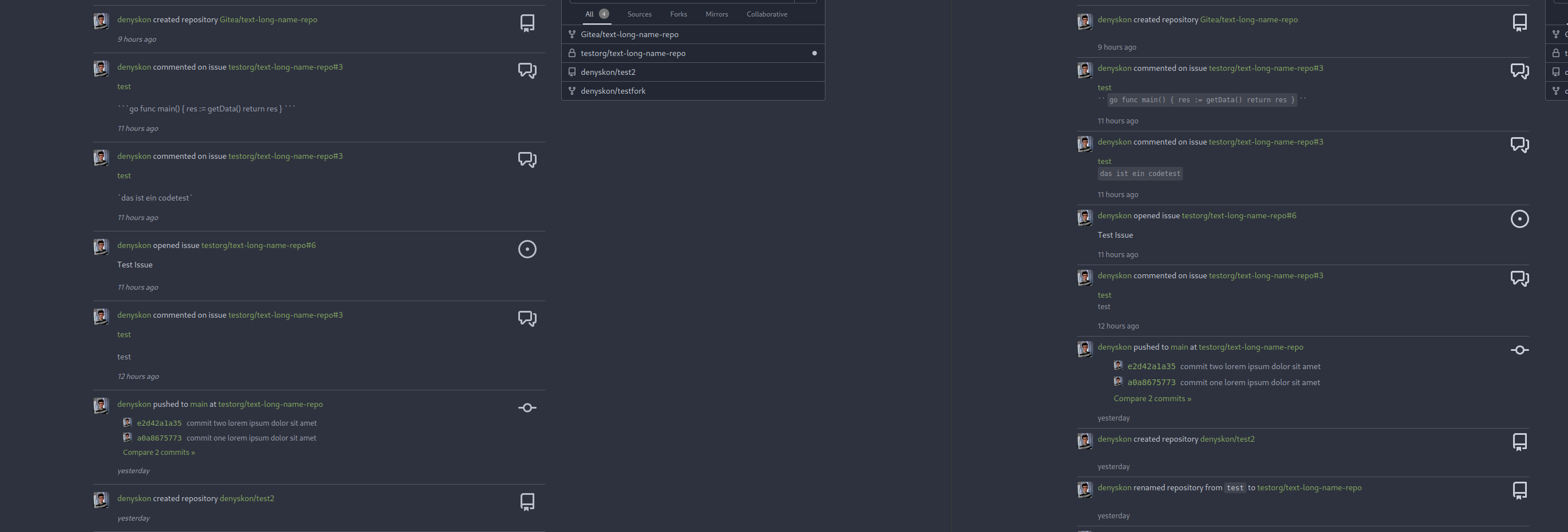
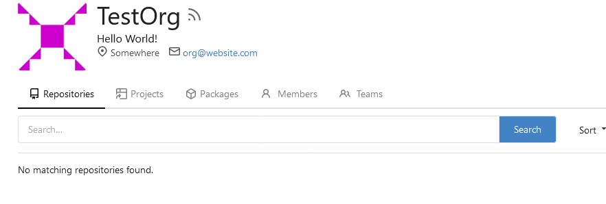
Unify organizations header before:  after:  --------- Co-authored-by: silverwind <me@silverwind.io> (cherry picked from commit 532e422027c88a4a3dc0c2968857f8d5f94d861f) Conflicts: routers/web/shared/user/header.go templates/org/home.tmpl context |
||
|
|
2da33aae2d
|
[MODERATION] User blocking
- Add the ability to block a user via their profile page. - This will unstar their repositories and visa versa. - Blocked users cannot create issues or pull requests on your the doer's repositories (mind that this is not the case for organizations). - Blocked users cannot comment on the doer's opened issues or pull requests. - Blocked users cannot add reactions to doer's comments. - Blocked users cannot cause a notification trough mentioning the doer. Reviewed-on: https://codeberg.org/forgejo/forgejo/pulls/540 (cherry picked from commit 687d852480388897db4d7b0cb397cf7135ab97b1) (cherry picked from commit 0c32a4fde531018f74e01d9db6520895fcfa10cc) (cherry picked from commit 1791130e3cb8470b9b39742e0004d5e4c7d1e64d) (cherry picked from commit 37858b7e8fb6ba6c6ea0ac2562285b3b144efa19) (cherry picked from commit a3e2bfd7e9eab82cc2c17061f6bb4e386a108c46) (cherry picked from commit 7009b9fe87696b6182fab65ae82bf5a25cd39971) Conflicts: https://codeberg.org/forgejo/forgejo/pulls/1014 routers/web/user/profile.go templates/user/profile.tmpl (cherry picked from commit b2aec3479177e725cfc7cbbb9d94753226928d1c) (cherry picked from commit e2f1b73752f6bd3f830297d8f4ac438837471226) [MODERATION] organization blocking a user (#802) - Resolves #476 - Follow up for: #540 - Ensure that the doer and blocked person cannot follow each other. - Ensure that the block person cannot watch doer's repositories. - Add unblock button to the blocked user list. - Add blocked since information to the blocked user list. - Add extra testing to moderation code. - Blocked user will unwatch doer's owned repository upon blocking. - Add flash messages to let the user know the block/unblock action was successful. - Add "You haven't blocked any users" message. - Add organization blocking a user. Co-authored-by: Gusted <postmaster@gusted.xyz> Reviewed-on: https://codeberg.org/forgejo/forgejo/pulls/802 (cherry picked from commit 0505a1042197bd9136b58bc70ec7400a23471585) (cherry picked from commit 37b4e6ef9b85e97d651cf350c9f3ea272ee8d76a) (cherry picked from commit c17c121f2cf1f00e2a8d6fd6847705df47d0771e) [MODERATION] organization blocking a user (#802) (squash) Changes to adapt to: |
||
|
|
f39256f035
|
Add word-break to organization name and description (#26624)
Fix #24318 Before:    After:     |
||
|
|
ee9e83b230
|
Remove incorrect CSS helper classes (#26712) | ||
|
|
b9baed2c74
|
Introduce flex-list & flex-item elements for Gitea UI (#25790)
This PR introduces a new UI element type for Gitea called `flex-item`. It consists of a horizontal card with a leading, main and trailing part:  The idea behind it is that in Gitea UI, we have many cases where we use this kind of layout, but it is achieved in many different ways: - grid layout - `.ui.list` with additional hacky flexbox - `.ui.key.list` - looks to me like a style set originally created for ssh/gpg key list, was used in many other places - `.issue.list` - created for issue cards, used in many other places - ... This new style is based on `.issue.list`, specifically the refactoring of it done in #25750. In this PR, the new element is introduced and lots of templates are being refactored to use that style. This allows to remove a lot of page-specific css, makes many of the elements responsive or simply provides a cleaner/better-looking way to present information. A devtest section with the new style is also available. <details> <summary>Screenshots (left: before, right: after)</summary>                    </details> --------- Co-authored-by: Giteabot <teabot@gitea.io> |
||
|
|
6598d0291c
|
Allow Organisations to have a E-Mail (#25082)
Resolves #25057 This adds a E-Mail field to Organisations. The E-Mail is just shown on the Profile when it is visited by a logged in User. The E-mail is not used for something else. **Screenshots:**   --------- Co-authored-by: Denys Konovalov <kontakt@denyskon.de> Co-authored-by: Denys Konovalov <privat@denyskon.de> Co-authored-by: wxiaoguang <wxiaoguang@gmail.com> Co-authored-by: Giteabot <teabot@gitea.io> |
||
|
|
e7495735d5
|
Fix position of org follow button (#25688)
This has recently regressed it seems. Put it back into same position as https://github.com/go-gitea/gitea/pull/24345. |
||
|
|
6bbccdd177
|
Improve AJAX link and modal confirm dialog (#25210)
Clarify the "link-action" behavior: > // A "link-action" can post AJAX request to its "data-url" > // Then the browser is redirect to: the "redirect" in response, or "data-redirect" attribute, or current URL by reloading. And enhance the "link-action" to support showing a modal dialog for confirm. A similar general approach could also help PRs like https://github.com/go-gitea/gitea/pull/22344#discussion_r1062883436 > // If the "link-action" has "data-modal-confirm(-html)" attribute, a confirm modal dialog will be shown before taking action. And a lot of duplicate code can be removed now. A good framework design can help to avoid code copying&pasting. --------- Co-authored-by: silverwind <me@silverwind.io> |
||
|
|
6a075589bf
|
Fix mobile navbar and misc cleanups (#25134)
- Fix and improve mobile navbar layout - Apply all cleanups suggested in https://github.com/go-gitea/gitea/pull/25111 - Make media query breakpoints match Fomantic's exactly - Clean up whitespace in class on navbar items Mobile navbar before and after: <img width="745" alt="Screenshot 2023-06-08 at 08 40 56" src="https://github.com/go-gitea/gitea/assets/115237/ca84b239-b10f-41db-8c06-dcf2b6dd9d28"> <img width="739" alt="Screenshot 2023-06-08 at 08 41 23" src="https://github.com/go-gitea/gitea/assets/115237/09133c54-eb7e-4110-858c-ead23c3b7521"> --------- Co-authored-by: wxiaoguang <wxiaoguang@gmail.com> Co-authored-by: Giteabot <teabot@gitea.io> |
||
|
|
b926f96da7
|
Reorganize CSS files (#24739)
Reorganize various CSS files for clarity, group together by subdirectory in `index.css`. This reorders some of the rules, but I don't think it should introduce any issues because of that. |
Renamed from web_src/css/organization.css (Browse further)